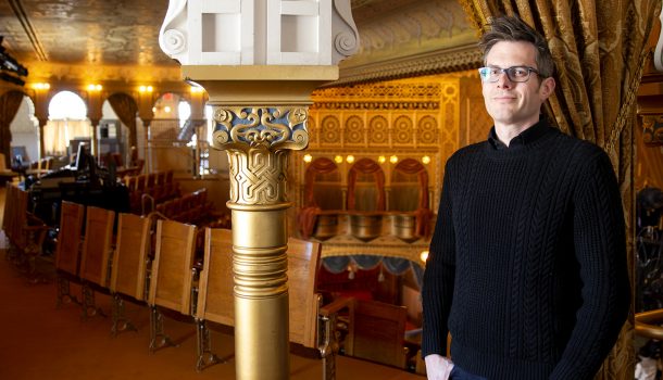
The historic Mabel Tainter Center for the Arts in Menomonie has been rebranded, thanks to a University of Wisconsin-Stout associate professor.
Erik Evensen, from the department of design, recently unveiled a new visual identity for the 130-year-old arts center, which is next to UW-Stout’s central campus.
Evensen has been working closely with Jeff McSweeney, the Mabel Tainter’s executive director, and Andrew Mercil, president of the board of directors. McSweeney began work in June, and Evensen began working on the project last fall.
Evensen uses Victorian-inspired typography and design elements but also includes variations that are more simplified and more visually complex. The main typeface is Sacred Bridge, with slightly modified letterforms, and the secondary typeface Gotham “to add a contemporary contrast.”
The blue, gold and red-brown “color palette was taken entirely from the theater’s interior design,” Evensen said.
“I wanted to make sure they have options,” Evensen said. “If they need something ornate and historic, they have that. If they need something clean and a little more modern, they have that. And ultimately, I’m thrilled to have captured some of the personality and the artistic integrity of the building.”
The theater is a charter member of the League of Historic American Theaters and was named by CNN Travel in 2014 as one of the world’s 15 most spectacular theaters.


